Get more information from your Google Analytics data
If you have a website, you probably have a goal in mind. From reading an article to downloading a whitepaper, or adding an item to an online shopping basket—there is an action you hope your site visitors will do.
But what sections of your site are high value, driving users closer to taking those actions you’ve identified as important to your business? And which ones need work? Are you spending your precious resources—time, money, and effort—in the areas that bring the greatest returns? This dashboard gives you the insight to answer those questions using goal actions pre-defined in Google Analytics.
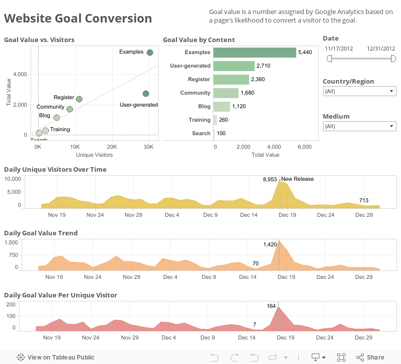
The top left scatterplot shows goal value as viewed against the total number of visitors—and highlights outliers. In this case, you can quickly see that the “User-generated” section receives nearly as many views as “Examples” but delivers much lower value. The bar chart to the right ranks website content by value, for at-a-glance understanding. The three trend lines at the bottom of the dashboard highlight changes over time, as viewed by three different measures. A label indicates the reason behind a particular peak—in this case, a new software release.