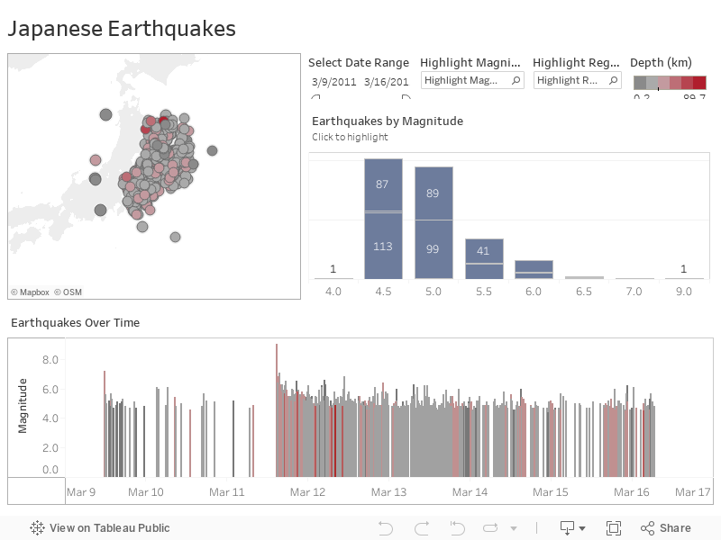
Map the seismic ripples of the 2011 Japan earthquake
In 2011, Japan was struck by a massive undersea earthquake and accompanying tsunami. Alex Kerin's visualization shows the seismic activity over the week around the quake. The bigger dots indicate stronger quakes and the redder dots highlight deeper quakes. The histogram on the sidebar is of particular interest. It shows that there were more than 10 quakes that registered higher than 6.0 on the Richter scale.
Create and share on Tableau Public
Join the newsletter and find daily inspiration with the Viz of the Day. Yours could be featured next!
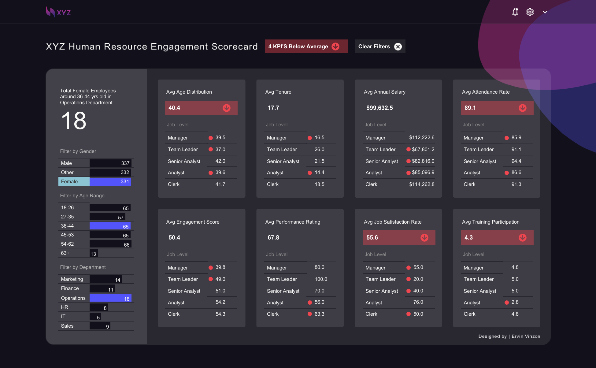
XYZ HR Engagement Scorecard
Learn how BANs can help you clearly display key metrics with this #VizOfTheDay by Ervin Vinzon. This Back 2 Viz Basics (#B2VB) entry visualizes employee engagement metrics using mock data by Adam Mico's GPT, Data Mockstar.
Interact with the viz